Colour choice is a big step when you’re redecorating. No matter which room – be it a home office, children’s bedroom or ensuite bathroom – the colour is going impact how that space feels in more ways than one.
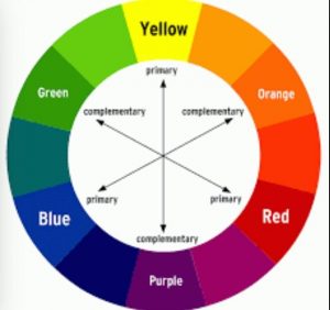
As you may know, colour plays an important role in the physical make up of your project. It highlights specific features, creates bold lines and shadows or flattens the ceiling and walls to create a sense of space. However, it also has psychological aspects to it. Here is a run down on how different hues can change the way you feel about a room.
Red ![]()
Red is a strong, passionate colour and can have quite drastic uplifting effects on the occupants of a red-inspired space. According to colour psychologists, red helps bring people together in a room and instigates conversation.
Hues like Sensual Red and Shiraz both bring out the energy in people, and create a powerful first impression around an entranceway. Some consider it too much for a bedroom, though that being said, its high adrenalin may still be for you. If you want red in a bedroom without going overboard, try using it on the wall behind the bed. That way you’ll get to enjoy it while you are moving around the room, but if you’re sick in bed you won’t have it keeping you awake.
Blue ![]()
Entirely the opposite of its red counterpart, blue acts as a peacemaker and is a calming colour to be amongst. In fact, anyone who talks to you about feng shui will discuss how serene and freeing the colour can be. However, the choice of blue is important because the wrong tone can create negative emotions, rather than calming ones.
For example, pastel blues can make a room appear cold and very dark blues can invoke a sense of sadness. Don’t avoid the colour, however, instead just focus more on mid-tones like Navy Blue or Periglacial Blue then scatter some warmer features to accompany.
Green ![]()
Though the mere mention of green might turn some of you away, don’t discount the colour just yet. According to feng shui, green is the ancient colour of movement and nature. It is a pleasant colour to look at and has a calming effect as well, thanks to it being a combination if blue and yellow.
Used in a study, office, library or other place of work it will help stimulate restful minds within the occupants, hopefully making them a little less distracted. If you’re worried about the look of a luminous lime green, consider something more along the lines of Citrone Green, Sushi Green, or use in small doses.
White ![]()
White and off-white are great for almost any room, and instantly brighten it up and disperse hard lines and shadows, offering a sense of space and happiness.
Whites like Merino or Half SoapStone symbolise purity, cleanliness and air, which is why they’re so good for small apartments, cramped houses and bathrooms. Covering the entire space, however, gives some people the idea of a sterile space – maybe because hospitals and such are predominantly bright colours. White can, however, be used to effectively uplift highlights and accents instead.
Greys/Blacks 
As a primary colour, greys and blacks don’t always work so well by themselves, as they can give off all of the wrong impressions. For example, black instantly darkens a room as it absorbs colour, and the wrong use of grey can give the impression of fear and restraint. Used to highlight, feature or accent, however, these neutral colours are perfect.
Set against a bright backdrop, such as white, black stands out perfectly and gives a sense of elegance. Grey can have a similar impact, too, though on a more subtle level. In your spaces, try defining with Delta Grey, Fuscous Grey or Grey Triple Mondo.
Hope you enjoyed Reading about these tips to help choose your colour for your home.